
A reimagined customer experience that engages and delights.

Organic, artisanal, small-batch, exotic, local—the market for America’s favorite condiment was getting more fragmented and more competitive. And one of the world’s most iconic brands was in danger of losing its place at the top. To rebuild brand equity, Heinz needed to understand what made their brand so beloved, and redesign accordingly. They also saw an opportunity to reduce the amount of material used, to save on packaging costs while reducing their environmental footprint.
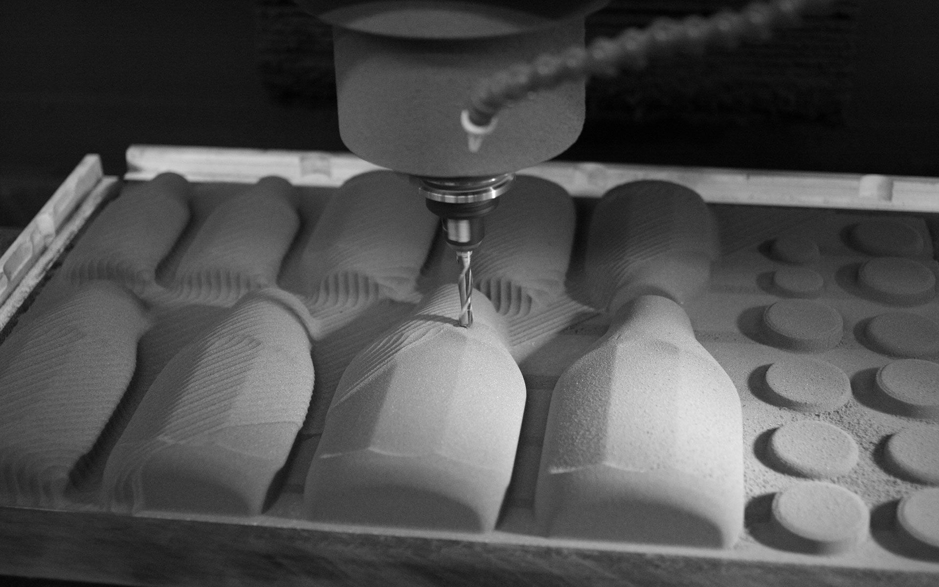
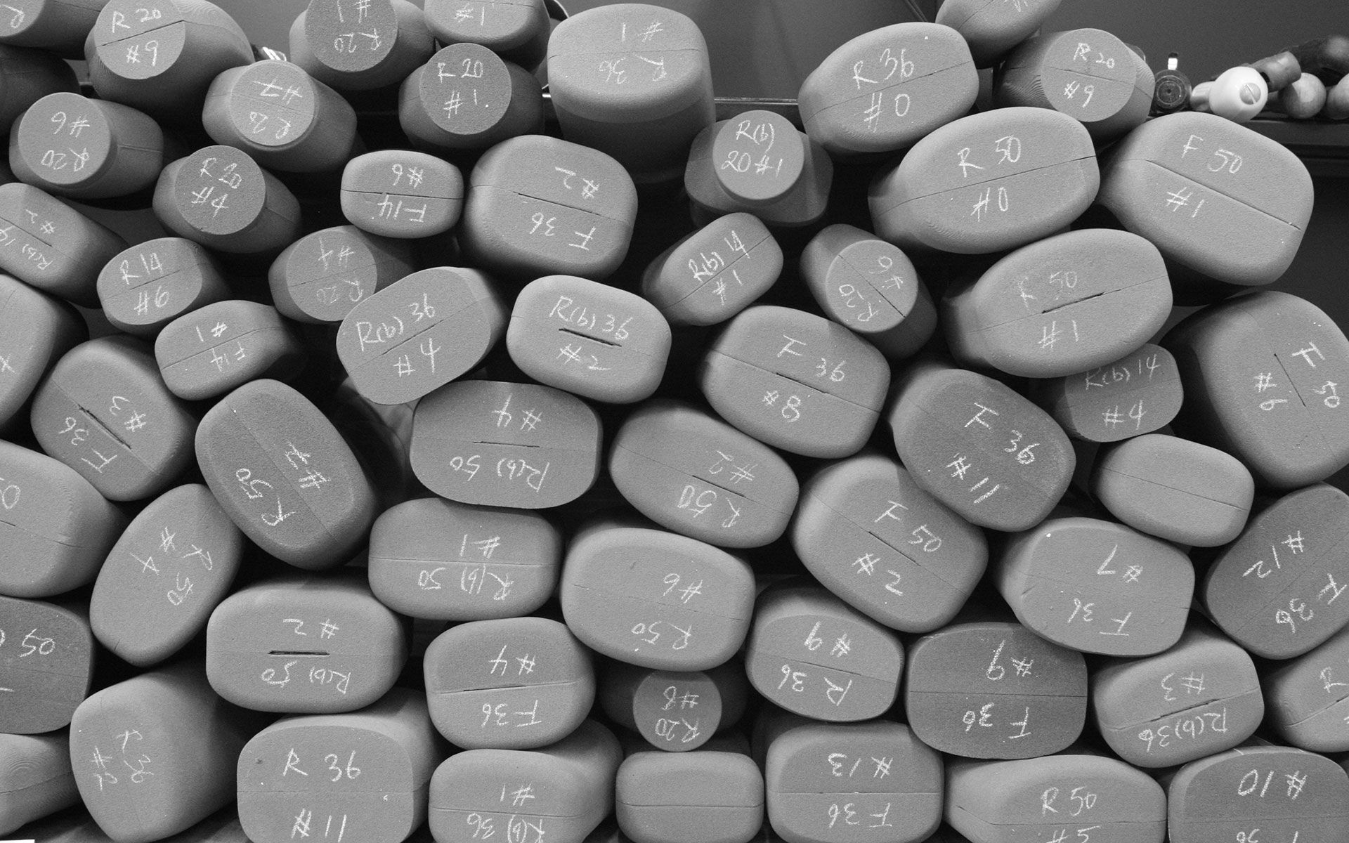
Ziba’s field research revealed a simple concept that held the answer to Heinz’s competitive threats: love. Other brands were exciting, affordable, unique…but only Heinz held a place in consumers’ hearts. So Ziba doubled down that love, by simplifying the product line and emphasizing what made the brand so special: its thickness and richness, and its unmistakable visual elements. An updated cap and bottle design captured those elements, making them instantly recognizable, and instantly lovable. Reducing the number of SKUs helped focus the product line, while making it more energy- and material-efficient for the manufacturing and filler lines.
Ziba’s redesign celebrated Heinz’s heritage among loyalists, putting classic elements like the faceted-scalloped bottle shape, the keystone-shaped label, and the raised “57” front and center. The streamlined range of new bottle and cap designs also saved over $10M per year in packaging costs.

Annual reduction in packaging costs
The Kraft Heinz Company is one of the world’s largest food and beverage companies.
Design Strategy
Brand Insights
User Insights
Communication Design
Product Design

